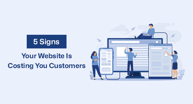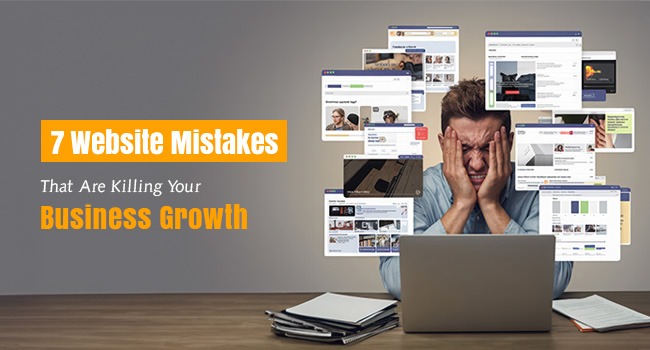
7 Website Mistakes That Are Killing Your Business Growth
Hook:Your website might look good but is it actually bringing you customers?Many businesses lose potential clients every day because of small but critical website mistakes. If your website isn’t converting visitors into leads, these hidden issues could be the reason. 1. The Turtle Pace (Slow Loading) The Vibe: If it takes more than 3 seconds, they’re gone. The Lowdown: In a “scroll-first” world, every millisecond counts. If your site takes more than three seconds to load, you aren’t just testing patience you’re handing leads to your competitors. Slow speed kills your Google ranking and tanks user trust instantly. Optimize your backend now, because a fast site isn’t a luxury; it’s the baseline for digital survival. 2. Desktop-Only Vision (Poor Mobile Optimization) The Vibe: Pinch-to-zoom is so 2010. The Lowdown: Most of your customers are scrolling on the go. If your website looks like a messy desktop port on a smartphone, you’re effectively invisible to 60% of the market. Modern web design is “mobile-first” by necessity. Responsive layouts aren’t just about shrinking images; they’re about thumb-friendly navigation and seamless experiences that feel native to any device. 3. The “Where Do I Go?” Maze (Weak UI/UX) The Vibe: Don’t make them think. The Lowdown: A beautiful website that’s hard to use is just expensive art. If your User Experience (UX) is clunky, visitors will feel “decision paralysis” and leave. Great design should be invisible, guiding the user’s eye naturally from the hook to the checkout. Don’t make your customers work to give you money clean up the clutter and prioritize a frictionless flow. 4. Ghost-Town Buttons (No Clear CTA) The Vibe: Ask and you shall receive. The Lowdown: A website without a clear Call-To-Action (CTA) is just a digital brochure. You can’t expect visitors to guess their next step; you have to lead them. Whether it’s “Book a Call,” “Shop Now,” or “Get Started,” your buttons should be bold, frequent, and impossible to ignore. Without a roadmap, your traffic will simply wander off into the digital void. 5. The Invisible Man (Poor SEO Structure) The Vibe: If Google can’t find you, customers won’t either. The Lowdown: You could have the best product in the world, but if your SEO structure is broken, Google won’t find you. Poor metadata, messy URL structures, and a lack of keyword hierarchy make you a ghost in the search results. Modern SEO is about “human-first” content backed by technical precision. If you aren’t optimized, you’re basically shouting into a vacuum. 6. The Digital Labyrinth (Bad Navigation) The Vibe: Keep it simple, stupid. The Lowdown: If a user has to click five times to find your pricing or contact page, you’ve already lost them. Confusing menus and hidden links lead to instant frustration. Your navigation should be a streamlined highway, not a labyrinth. Keep your header clean, categorize logically, and ensure the most important information is always just one intuitive click away. 7. The Wayback Machine (Outdated Design) The Vibe: 1998 called, it wants its layout back. The Lowdown: First impressions are 94% design-related. An outdated layout with “retro” vibes unintentionally screams “unreliable” or “out of business.” In 2026, high-converting sites use clean typography, strategic white space, and immersive visuals to build instant authority. Don’t let a 2018 aesthetic ruin your 2026 growth. If your site looks old, customers assume your solutions are too. CTA: Stop guessing, start converting. Is your website a growth engine or a graveyard? Let our experts overhaul your digital presence for maximum impact.